Recreating the latest design fad in SwiftUI
Browsing Dribbble’s popular feed is a bit of a hobby of mine. I like to see the latest trends designers are cooking up in their labs. If you’ve browsed Dribbble recently, you might’ve noticed a certain new design style making the rounds.

One shot in particular really caught my eye. With a unique style, this viral app mockup has popularized a return of a sort of skeuomorphism, with interface elements that look three-dimensional without gloss or gradients. The simple trick is two shadows — one light and one dark, at opposite ends of an element — to give the appearance of a side-lit button. Some have dubbed this style “neumorphism”.
That mockup immediately reminded me of the OP-1 synthesizer and its simple white raised buttons:
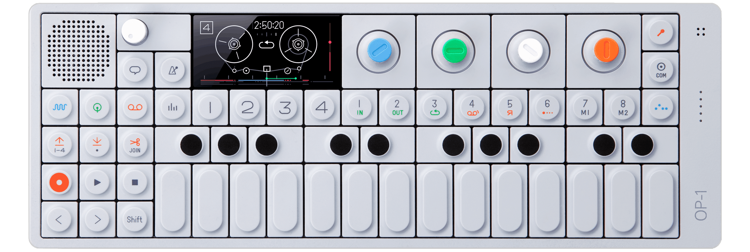
Personally, I think these buttons look great.
I thought it would be a fun exercise to try to recreate this look in SwiftUI, which I’ve been curious to try since its announcement last year. It seems fitting to create a trendy design style with a trendy UI framework. If you’d like to follow along, you can download the project as a Swift Playground, which you can open in the new Swift Playgrounds app for macOS or iPadOS. Or, check out the GitHub repo: https://github.com/hallee/neumorphic-style

Let’s start with a simple SwiftUI button.
var body: some View {
    Button("Hello world") { }
}
An important requirement for the ‘neumorphic’ style is that the background color can’t be fully white or fully black; there has to be room for the light shadow to be lighter than the background, and the dark shadow to be darker than the background. So, we need to add an off-white background color, along with a frame modifier to allow the background to stretch to fill its container.
let color = Color(red: 232/255, green: 238/255, blue: 246/255)

var body: some View {
    Group {
        Button("Hello world") { }
    }
    .frame(minWidth: 0, maxWidth: .infinity,
           minHeight: 0, maxHeight: .infinity,
           alignment: .center)
    .background(color)
}
Now we can modify the button to achieve the look we want. First, we’ll need a background for the button. Let’s add a rounded rectangle background, and give it a simple drop shadow.
let color = Color(red: 232/255, green: 238/255, blue: 246/255)

var body: some View {
    Group {
        Button("Hello world") { }
            .padding()
            .background(
                RoundedRectangle(cornerRadius: 12, style: .continuous)
                    .foregroundColor(color)
                    .shadow(radius: 12)
            )
    }
    .frame(minWidth: 0, maxWidth: .infinity,
           minHeight: 0, maxHeight: .infinity,
           alignment: .center)
    .background(color)
}
What we really want are two drop shadows. We can do this pretty easily since SwiftUI modifiers can stack, and we can offset each drop shadow to opposite corners to simulate a light source coming from the top-left corner.
// ...
Button("Hello world") { }
    .padding()
    .background(
        RoundedRectangle(cornerRadius: 12, style: .continuous)
            .foregroundColor(color)
            .shadow(
                color: .white,
                radius: 12,
                x: -6,
                y: -8
            )
            .shadow(
                color: Color.black.opacity(0.8),
                radius: 12,
                x: 6,
                y: 8
            )
    )
// ...
This still doesn’t look great. The shadow colors look very unnatural. The fix is easy: we can set .blendMode(.overlay) on the shadow to make it modify the background color in a more natural way. One caveat to changing the blend mode is that this changes the color of the RoundedRectangle, so we have to layer another RoundedRectangle on top with the color we actually want.
// ...
Button("Hello world") { }
    .foregroundColor(Color.primary)
    .padding()
    .background(
        ZStack {
            RoundedRectangle(cornerRadius: 12, style: .continuous)
                .shadow(
                    color: .white,
                    radius: 12,
                    x: -6,
                    y: -8
                )
                .shadow(
                    color: Color.black.opacity(0.8),
                    radius: 12,
                    x: 6,
                    y: 8
                )
                .blendMode(.overlay)
                .padding(2)

            RoundedRectangle(cornerRadius: 12, style: .continuous)
                .foregroundColor(color)
        }
    )
//...
This looks pretty good! But our button view is now a 25-line monstrosity. The colors are baked in, and it doesn’t animate when tapped. Ideally we would define this as a button style that respects the system appearance, and that could be automatically applied to every Button in our project.
SwiftUI allows for just that with the ButtonStyle protocol. The system provides a variety of pre-made ButtonStyles (like the default DefaultButtonStyle), and we can define our own by creating a struct conforming to the protocol.
The meat of this protocol happens in the function makeBody(configuration: Self.Configuration) -> some View, where we can construct a totally custom view for the button. Self.Configuration provides the given button’s label view, along with a boolean isPressed, which we can use to modify our button style’s properties based on the pressed state.
Using ButtonStyle we can shrink our Button back down to a single line of code:
// ...
Button("Hello world") { }.buttonStyle(NeumorphicButtonStyle(colorScheme: colorScheme))
// ...
NeumorphicButtonStyle takes in a ColorScheme so that the button can react to the system light or dark appearance setting. The style also doesn’t have to be directly applied to the button; you can place the .buttonStyle modifier on any view in the stack, including the root ContentView of an app, so that it applies to every button created in the whole project. The style provides a nice springy pop effect on button taps, too:
// ...
.scaleEffect(configuration.isPressed ? 0.99 : 1)
.animation(
    .interactiveSpring(
        response: configuration.isPressed ? 0.24 : 0.3,
        dampingFraction: 0.4,
        blendDuration: 0.6
    ),
    value: configuration.isPressed
)
// ...
My full implementation of NeumorphicButtonStyle is a bit beyond the scope of this blog post, but you can download or share the complete Swift Playground, or check out the GitHub repository for NeumorphicButtonStyle: https://github.com/hallee/neumorphic-style
I really like SwiftUI’s ButtonStyle protocol. It provides a really clean way to modify the appearance of buttons globally without changing any view implementations. I could imagine swapping out ButtonStyles on the root view of an app as a way to theme the appearance beyond light and dark modes. There are also other protocols, like ToggleStyle, so maybe I’ll extend this neumorphism concept to toggle controls, too.
